context
uzum is a unicorn ecosystem with 20 million users.
uzum business is its bank for companies, where businesses send thousands of big payments every day. first you create a payment, sign it and send it to the bank, where it has a long, complicated way to go. all that time people had no idea what was going
on with their payment. and a payment is the most important part
of a financial service: people need to see clearly where it is, to
save time, keep things simple and feel safe. we decided to fix that
statuses
after you send a payment, it goes through 10 systems, and each one gives it its own technical status. the 14 payment types each have their own set of them. people did not understand the statuses, opened a payment several times a day and messaged support. i started by boiling it all down to 4 clear statuses,
the same for every type
Uploading
Entered
Undefined
Sent to the bank
Under bank review
Processing
Sent to head office
Sent to settlement center
Sent to TCR
Processed at the branch
Processed
Account cancelled
Rejected
Ready to send
Sending
Sent
Couldn't send
payment details
then i took on the payment details, where that status lives.
the screen was crammed with data. i rebuilt it on the new design system we had made with the team. so that 14 teams would build the details the same way, i wrote down how the screen behaves, walked them through it on a call and handed it over as a template
old
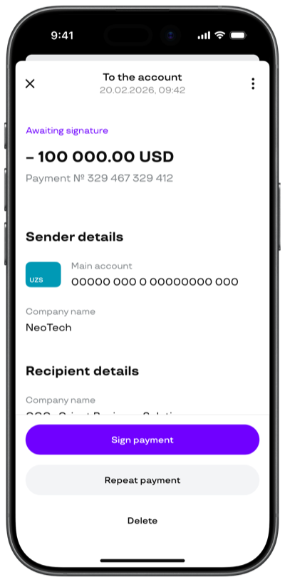
new
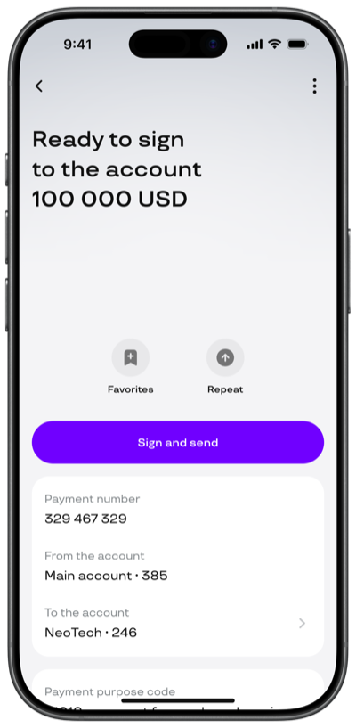
in the "sending" status we show when the payment will go through

payment history
you get to the payment details through the payment history,
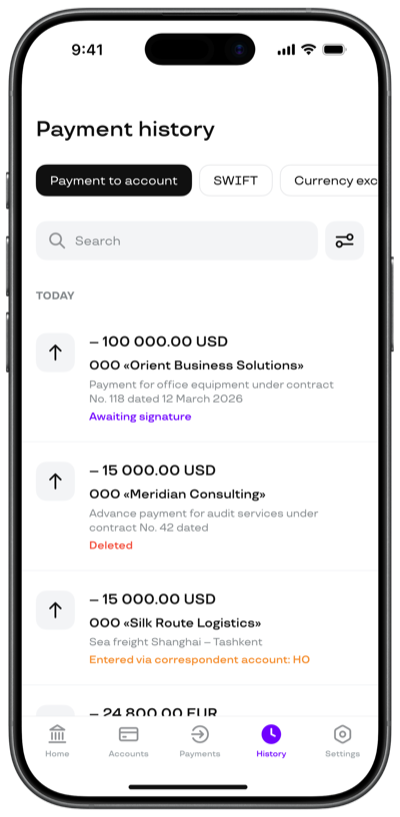
where every payment type lived in its own tab. the filters people use most were hidden, and hardly anyone used the search.
i redesigned the page and left in the history only the data that helps you tell which payment is which
old
new
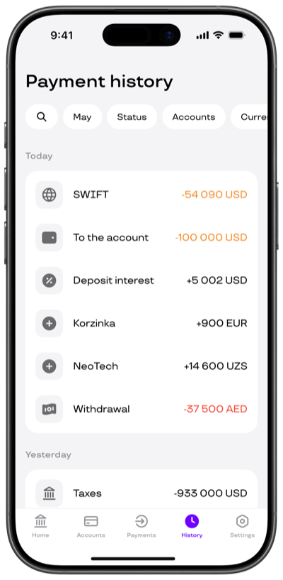
the "zoom transition" animation that did not make it into the release
notifications
but the experience outside the app needed thinking through too, with push notifications, so you can follow a payment's status without opening the app
results for the quarter
today people understand what is going on with their payment
and make everyday decisions with a clear head. support requests are down 74%, finding the right payment is 3x faster,
and repeat payments are up 18%
credits
this case shows only a small part of the decisions i made over
8 months of work, where i was the lead designer alongside a product manager, an analyst and a bunch of developers. happy to go into more detail in person
after a hard sprint i wanted free fall. jumped solo
from 1.600 m